Loading ...
Update

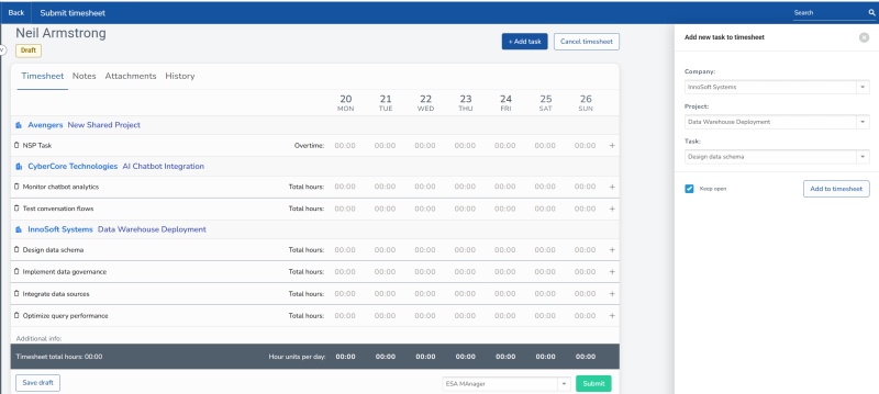
New timesheet design

Introducing phase one of our a new redesigned timesheet experience — bringing a cleaner, more modern interface to your timesheets.
Author: Michael Gois
Published: 22/05/2026

We’re excited to launch the first phase of our redesigned timesheet experience — bringing a cleaner, more modern interface to Timesheet Portal.

This release introduces updated colours, improved typography, and a wider, fully responsive layout that adapts seamlessly across different screen sizes. Whether on desktop or mobile, users will benefit from a more intuitive and consistent experience.

Despite these enhancements, the familiar layout remains, with most buttons and labels staying exactly where users expect them — ensuring a smooth, disruption-free transition.

The only structural change is to the task entry panel (for project accounts), which has been updated as part of the new design.

Take a look at the preview below to see what’s coming to your Timesheet Portal interface.

The below image shows the new Add Task panel, which now opens on the right hand side of the screen rather than within the timesheet itself. 

Last but not least, the below image shows the new timesheet format on a typical recruitment structure. Note the change of panel for pay/charge rates (which only shows if you have this enabled on your account).

Free trial

See for yourself how you can save time and money. Enter your details below for a free 30 day no-obligation trial.